ukrlex wrote: ↑Sat Aug 29, 2020 10:11 pm
David, you wrote that Cap lab post-release beta v.6.6.03 has " New Interfaces. 1) The toolbar at the left of the screen and the bottom menu bar have been completely redesigned, giving them a modern look".
The new interface really resembles buttons from primitive mobile games for children. It is absolutely inconvenient to use them. Bad pictures, poor color rendering, often - the purpose of the picture is unclear and you need to use a pop-up menu, pictures interfere with the game.
If you could provide me with more specific details about which icons you are not happy with, I will forward your comments to the dev team.
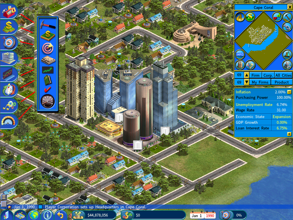
To facilitate that, I have put together the following screen comparing the new and old interface.

Let's go over them one by one:
Build firm icon - the new icon is a tool box in the shape of a house, implying that it is for building firms.
Buy land icon - it is very similar to old one, with improved shape and lighting.
Goal icon - it retains the design of the old one, with improved rendering and lighting.
HQ icon - With the new HQ word on it, it is actually easier to tell what the icon means than the old one.
Stock market icon - it retains the design of the old one, in a new graphic style.
The game menu icon - The old design, which is a book icon, is no longer the common icon design for accessing the game menu these days. That is why the artist has redesigned it to adhere to the modern icon design standard.
Options menu icon - the same reason as above. The tick icon used in the original interface does not do a very good job telling what the icon means. Thus it was replaced with the new icon, which is more fitting for its purpose.
The game speed icon - it retains the design of the old one, in a new graphic style.
Please let me know specifically which of these icons your criticism in your post was referring to and the exact reasons, and I will forward your comments to the dev team.
The image with available money should not be in the center of the screen. The goal of the game is not to enter IPO or receive money from bond.
Please be informed that the bar showing the public investor money is ONLY available when you enabled the Realistic Money Supply option and in Survival mode of the CES DLC. Otherwise it is not shown.
The dev team actually hasn't made any changes to this interface between v6.5.x and v6.6.x. If you have a different opinion with this interface, I would recommend that you post a new topic in the appropriate subforum, as this discussion thread is about the v6.6.03 installer.
You could post in the Suggestions forum about eliminating this interface and provide your reasoning. Like all suggestions, it will collect feedback from the community. If there is sufficient support from the community about removing it, the dev team will take note and consider making the change.