Bad Information Center Highlight Button

Technical support requests for Capitalism Lab
Brutus
Level 4 user
Posts: 139
Joined: Fri Jun 12, 2020 3:44 pm

Bad Information Center Highlight Button

Post by Brutus »

The information center button is just plain badly aligned when highlighted.

Every time you highlight it my brain is literally screaming at me telling me that my vision is going blurry and crossed eyed or something ... and I am already cross eyed so :lol:

It's so incredibly jarring in that my eyes think they are going blurry and need to focus more to get the image to become sharper but ... no ... no that's just the way the image looks :? ooof
InformationButtonBad.png
InformationButtonBad.png (6.39 KiB) Viewed 2204 times
This is the only part about the new UI aesthetic that I am unhappy about. I was originally against the entire new UI but it has actually grown unto me over time ... except for this thing ... god I just hate pressing this button so much ... better to use the macro then to ever have to hover over it and suffer my brain from popping out an error message telling me I need to focus on the icon more. :x
User avatar
David
Community and Marketing Manager at Enlight
Posts: 10438
Joined: Sat Jul 03, 2010 1:42 pm
Has thanked: 78 times
Been thanked: 228 times

Re: Bad Information Center Highlight Button

Post by David »

My suggestion: you may use the shortcut key 'i' instead of clicking the icon.
Brutus
Level 4 user
Posts: 139
Joined: Fri Jun 12, 2020 3:44 pm

Re: Bad Information Center Highlight Button

Post by Brutus »

David wrote: Fri Mar 26, 2021 5:00 am My suggestion: you may use the shortcut key 'i' instead of clicking the icon.
I was already doing that :mrgreen: I seem to have called it a macro but it's obviously a hotkey :?

I just realized I should have made this post in the ''Interface Improvement Suggestions'' thread as well. :lol: My bad.

I'm just wondering though, you do see it as well right? This is the only button which appears misaligned and looks somewhat jarring at the moment correct? :(
User avatar
David
Community and Marketing Manager at Enlight
Posts: 10438
Joined: Sat Jul 03, 2010 1:42 pm
Has thanked: 78 times
Been thanked: 228 times

Re: Bad Information Center Highlight Button

Post by David »

Brutus wrote: Fri Mar 26, 2021 8:56 pm
David wrote: Fri Mar 26, 2021 5:00 am My suggestion: you may use the shortcut key 'i' instead of clicking the icon.
I was already doing that :mrgreen: I seem to have called it a macro but it's obviously a hotkey :?

I just realized I should have made this post in the ''Interface Improvement Suggestions'' thread as well. :lol: My bad.

I'm just wondering though, you do see it as well right? This is the only button which appears misaligned and looks somewhat jarring at the moment correct? :(
If you capture screenshots of both versions of the icon (highlighted and normal versions) and compare them, you will see that they are actually aligned. Maybe the glow over the icon gives the illusion of misalignment.
Brutus
Level 4 user
Posts: 139
Joined: Fri Jun 12, 2020 3:44 pm

Re: Bad Information Center Highlight Button

Post by Brutus »

David wrote: Sat Mar 27, 2021 1:30 am Maybe the glow over the icon gives the illusion of misalignment.
Yup pretty much that. But whether it is an illusion or not, that doesn't stop my brain from telling me its misaligned :lol:

I think it's because the ''I'' button is a letter only icon whereas all the other new UI elements are solid pictures which when highlighted cause the image to pop out whereas with this button since it doesn't have a solid body interior filling the space between the I and the circle it looks more like a duplication of the icon as when it is highlighted it causes its luminosity to increase of the shadowy background image causing you to see two buttons to overlap. I strongly believe that this illusion isn't done intentionally like this but I suspect it is a consequence of the method used in highlighting the button itself. This method works fine for all the other UI elements because they are solidly filled images and don't use the color white to make up the icon itself, this is the only button which is entirely white and does not have a filled in body creating this problem. You can also slightly see this problem occur with the space left between the arrows around the ''Game Menu'' button but it is still a solid enough icon not to become a problem. Only this button has this issue. Here I've blown up the actual image so you can more clearly see what I'm talking about.

InformationButtonBadBlowUp.png
InformationButtonBadBlowUp.png (90.93 KiB) Viewed 2151 times

As you can see when you highlight this button it creates two visual circles and two I's where there ought to be one. None of the other UI buttons do this weird double image thing because they have solid bodies hiding the highlight-able UI element behind it for the most part and don't use white as a color for the icon itself. The I therefore appears duplicated when you highlight it as you can clearly see there are two I's hugging each other right now when they should either overlap perfectly or make sure to keep 6 feet distance between each other while wearing masks. ;)

When the button is not highlighted, the part that does become highlight-able appears as the shadow of the Icon on the button itself, which is fine and actually looks pretty good. I like that aesthetic but as soon as you highlight the actual button, the shadow becomes more prominent and more luminous making it appear as if there are two I icons misaligned together. You can clearly see there are two I heads standing next to each other with some dark pixel space between the two heads creating the illusion that these are separate I's when in fact they are meant to be one true I button.

Here I made a quick mockup to show what it would look like if there was no dark space between the two I's and look the I is much crispier looking now. Compare the original with my paint botch. Left Top and Left Bottom are the originals from the game, normal and highlighted, and the Right Top and Right Bottom are my alternate versions of when it is highlighted. In the Right Top I, I eliminated the second shadow I in the background and only increased the luminosity of the original I to make it pop out from the original. In the bottom versions I eliminated all the dark pixel space that is left over when highlighted from the original. Bottom Right is a thicc boy and my personal preference goes to the Top Right version as it looks sleek crispy and nicer looking than the bottom right or left versions. But even the bottom right one looks better and more consistent than the vanilla highlighted version.

InformationCenterHighlightBotch.png
InformationCenterHighlightBotch.png (11.43 KiB) Viewed 2151 times

Yeah I know my icon still looks like trash :lol: it's just to show that it looks crispier and more continuous as there's only a single I which can be seen. Top Right version looks lovely to me :D

I know I must appear incredibly nit picky when it comes to this ... perhaps a bit of a whiner :mrgreen: I fully admit to it, I just think it would look quality wise much more professional if this looked crispy clear as opposed to the way it is now. It's just a quality assurance thing or something. I'm that guy that makes their colleagues work over time over something as stupid as this until it is perfect and we've wasted hours to fix something trivial. This also applies quality wise to the toggle analysis button you have in the firm view.

ToggleAnalysisMode.png
ToggleAnalysisMode.png (11.13 KiB) Viewed 2151 times

It looks like the button was slapped onto the UI rather than being incorporated properly into the UI element. It doesn't even have a proper edge around the image with a box to separate it from the firm view and looks like it's a temporary alpha button that still needs to be updated properly in the future. I mean I love the functionality that it added none the less but it just doesn't look professional in the slightest the way it is shown right now. It does not mesh well together with the rest of the UI ...

If you think I'm whining or something, I do think you'd be justified somewhat and I'll let my nitpicking end here but quality wise I think the UI would look MUCH more professional if little things like this were properly taken care off. Also i would like to mention that I've found the fact that you are listening to everyone's input on this forum an extremely amazing experience and truly makes the community feel involved in improving the quality of the product and makes them feel they are heard and respected. Truly it is probably not said enough but it does show true commitment from the developing studio and to see Capitalism still chug along after all this time improving ever so slightly every time brings a tear to my eyes of joy. Bravo man. Really happy to see that and really happy I purchased this game and its dlc. :D
User avatar
David
Community and Marketing Manager at Enlight
Posts: 10438
Joined: Sat Jul 03, 2010 1:42 pm
Has thanked: 78 times
Been thanked: 228 times

Re: Bad Information Center Highlight Button

Post by David »

I would recommend that you create a poll for your suggestion of improving the Information Center button. If enough people think the same, I can use the poll result to persuade the artist to improve it.
It looks like the button was slapped onto the UI rather than being incorporated properly into the UI element. It doesn't even have a proper edge around the image with a box to separate it from the firm view and looks like it's a temporary alpha button
I agree with your view and I will tell the artist about your suggestion of adding a edge around the image.
Brutus
Level 4 user
Posts: 139
Joined: Fri Jun 12, 2020 3:44 pm

Re: Bad Information Center Highlight Button

Post by Brutus »

David wrote: Mon Mar 29, 2021 9:42 am I would recommend that you create a poll for your suggestion of improving the Information Center button. If enough people think the same, I can use the poll result to persuade the artist to improve it.
Yeah nevermind, I just realized I could fix this one for myself just now by altering the original UI element. Here are the images for anyone that is also interested in changing it. Look how crispy it looks! I even got rid of some of the white blur that made the button vague.

Save images and dump them in the ''C:\Users\[YOUR USER NAME]\AppData\Local\Capitalism Lab Post-Release Beta\image\MenuBar

Info_n.png
Info_n.png (4.12 KiB) Viewed 2042 times
Info_d.png
Info_d.png (4.52 KiB) Viewed 2042 times
Info_o.png
Info_o.png (4.62 KiB) Viewed 2042 times
Make sure to backup the original in case you wish to revert or just reinstall the whole program :lol:

Interestingly I found a 'possible' bug because of this. There are 3 buttons for the information center.

Info_n, used when button is in neutral position
Info_d, used when button is pressed down on and menu is open
Info_o, used when button is being hovered over.

however info_d is not used by the program even when the information center is up as you would expect with other buttons like 'toolbox', 'mini-map' and 'world map'. Not a big deal but just something I came across.
I agree with your view and I will tell the artist about your suggestion of adding a edge around the image.
I would have fixed this one myself as well and given it to you but I can't find it in the files anywhere. It's probably a COL or ICN file which i have no idea how to access or open. (could you advise on this matter?) I might even give your artist a few extra hours drinking coffee or something and I don't mind fixing stuff myself.

Ah man my OCD is kicking in ... more UI elements can use improvement ... must resist ... no I can't ... noooo!!!! the power is too stronk ... must correct ...

UI_improvement.png
UI_improvement.png (41.28 KiB) Viewed 2043 times
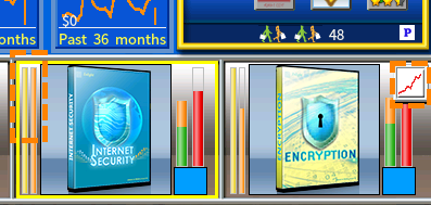
As you can see in this picture, the right orange marked box on the right, the ''product sale graph'', is partially blocking marketshare indicator bar of the 4th product. You could move this button next to the ''for sale'' button. Just a thought. Not too bad. I never look at the red bar anyway ... didn't even know what it was for until just now :mrgreen:

More annoyingly though is the left orange marked area. The background window image that a product is placed over becomes progressively more white towards the top, this causes people with bad eye sight (like myself) or color blindness not to be able to see where the yellow bar ends at a lot of times. Again I'd fix all of this myself but this is another UI element that I could not find/touch it seems. Probably another COL or ICN file.

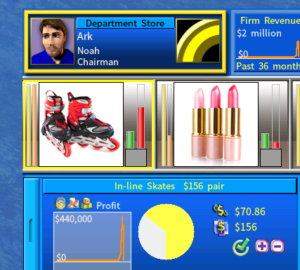
Lastly the company color that is light yellow is barely visible on a white pie chart or anything with whiteness next to it. If you could make it a just a few shades darker it would be possible to actually see it with the naked eye and without straining the eye socket :lol:
HardToSeeYellow.png
HardToSeeYellow.png (80.22 KiB) Viewed 2036 times
User avatar
David
Community and Marketing Manager at Enlight
Posts: 10438
Joined: Sat Jul 03, 2010 1:42 pm
Has thanked: 78 times
Been thanked: 228 times

Re: Bad Information Center Highlight Button

Post by David »

I would have fixed this one myself as well and given it to you but I can't find it in the files anywhere. It's probably a COL or ICN file which i have no idea how to access or open. (could you advise on this matter?)
You can find the files at
<CapLab folder>\IF\AnalysisMode0.PNG and AnalysisMode1.PNG
paulwoman
Translation Contributor
Posts: 783
Joined: Tue May 24, 2016 4:22 pm
Has thanked: 6 times
Been thanked: 7 times

Re: Bad Information Center Highlight Button

Post by paulwoman »

Brutus wrote: Thu Apr 01, 2021 12:53 pm The background window image that a product is placed over becomes progressively more white towards the top, this causes people with bad eye sight (like myself) or color blindness not to be able to see where the yellow bar ends at a lot of times.
I wonder if it is possible to add a special option for colour blind people
Brutus
Level 4 user
Posts: 139
Joined: Fri Jun 12, 2020 3:44 pm

Re: Bad Information Center Highlight Button

Post by Brutus »

David wrote: Fri Apr 02, 2021 8:40 am
I would have fixed this one myself as well and given it to you but I can't find it in the files anywhere. It's probably a COL or ICN file which i have no idea how to access or open. (could you advise on this matter?)
You can find the files at
<CapLab folder>\IF\AnalysisMode0.PNG and AnalysisMode1.PNG
Ah thank you so much, can't believe I missed that folder ... I'm still having trouble finding the image for the background used for products. I thought it would be AM_Slot but it's not.

Anyways here are my buttons.

Sleek versions (custom edge and box)
AnalysisMode0New.png
AnalysisMode0New.png (3.55 KiB) Viewed 1997 times
AnalysisMode1New.png
AnalysisMode1New.png (3.81 KiB) Viewed 1997 times
Thicc versions (based on default button edge and size)
AnalysisMode0BiggerNew.png
AnalysisMode0BiggerNew.png (3.88 KiB) Viewed 1997 times
AnalysisMode1BiggerNew.png
AnalysisMode1BiggerNew.png (4.02 KiB) Viewed 1997 times
I'm personally using the Sleek versions because I made the edge myself and it just looks a tiny bit better imho fitting the rest of the firm box than the regular sized button format does.

Im still not 100% happy with it but it's better than what I had to look at before. I may make another version with thiccer edges that are more pronounced. This will have to do for now though.

Feel free to use at your own discretion.

P.S
Might it be possible to have access to the old Building images used in previous capitalism lab versions such as the old Computer Store, Department, Sports Store, etc? I think I could repurpose some of them. It would be great if they were included in the modkit as resources for modders to use as well. Could you consider adding them to the modkit in a future update? Thanks! :mrgreen:
Post Reply